Mind Memory
A logo made for an interactive game at the International Spy Museum where guests test their memorization skills by trying to recall all items in the brief case within a time limit. While designing this logo I wanted to really keep the theme of “SPY” and what it represents by really stick to the color scheme and it’s overall brand and theme. I wanted to keep this design very simple and straight to the point.


Keyword Association
Brainstorming (Mind mapping + Keyword association)
Before diving into the logo I like to sit down and really think about what I want to convey for the final piece. I like to make a keyword association list and go from there. I take the words “Mind” and “Memory” and come up with a list associated with those words. It helps me narrow down the best words to focus on wen thinking of a logo image.
Sketch ideas
After brainstorming, I go into the sketching phase. With this logo I wanted to keep things sleek and simple, like the SPY brand. I draw at least 3 to 5 sketches before I go in and pick and choose what I like from each sketch, once I’m done I draw a more refined sketch of what I want the finished product to look like. In the sketch, I was going for a hat with the words mind memory above and below the image but after contacting the client and re-working a different sketch we both decided on going with another design choice.

Mind Memory logo sketch
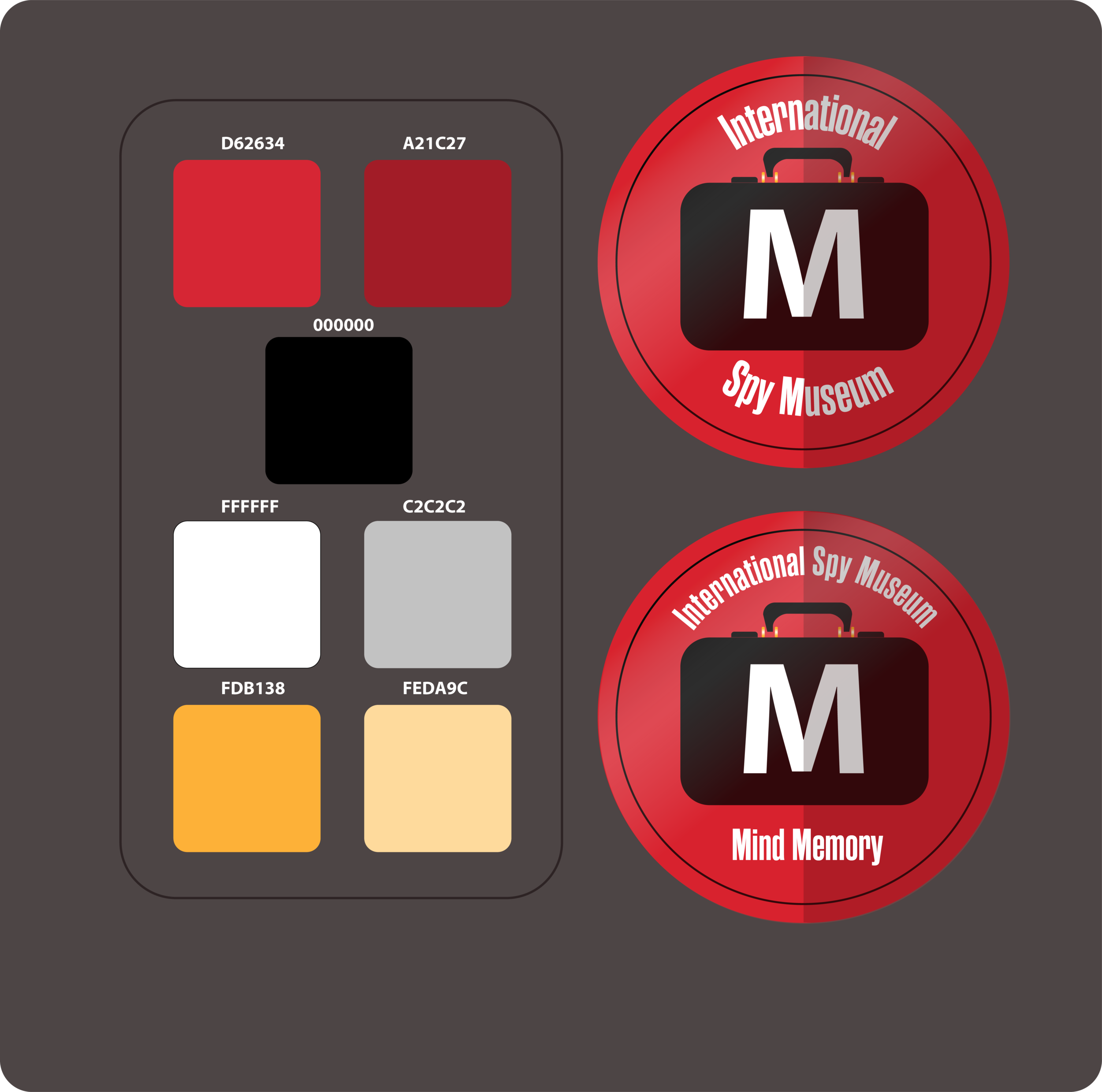
Colors + Logos
Color Design + Finalization
Ultimately I decided on going with a briefcase for the center image instead of the hat. It worked better because the game is played out of a briefcase and it just made sense! After getting approval from the client I moved forward with choosing an appropriate color palette.
I stuck with the classic red, black, and white to match SPY’s overall look.